Do’s & Don’ts of Web Design
When defining the design of your webpage, it is important to know what is relevant nowadays to create an attractive but more important user-friendly and navigable website.
Here are some do’s and don’ts to take into consideration at the moment to design your webpage:
Do |
Don’t |
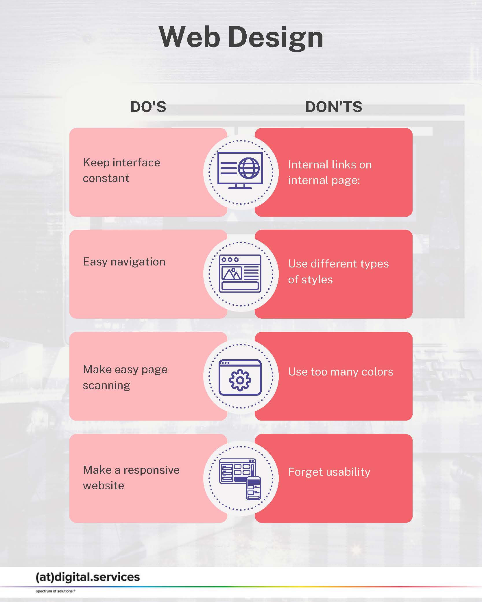
| Keep interface constant: The look and feel of your website should be consistent across the whole website. | Internal links on internal page: Don’t include external pages to open on your page. Ideally, they should open a new tap, while internal links follow the internal path in the same tap. |
| Easy navigation: Design to users navigate properly throughout the webpage as well as get what they are looking for. Keep the essentials at the top of searching reducing the path for users and decreasing the option to leave the page. | Use different types of styles: don’t use too many font types. Define one or two for the whole page. It will be easy and nice to read.
|
| Make easy page scanning: It is easy for users to scan the web pages, then read page by page. Place the most important visuals and text in a way the user will find easy what you want to present. | Use too many colors: keep a color scheme on your website. Ideally, follow the corporate image you want to bring to your company.
|
| Make a responsive website: Think about the devices people use to get to your website. Then, set a page that agrees to this feature without losing the design and concept. | Forget usability: Don’t leave out that usability is more important than being nice and beautiful. |
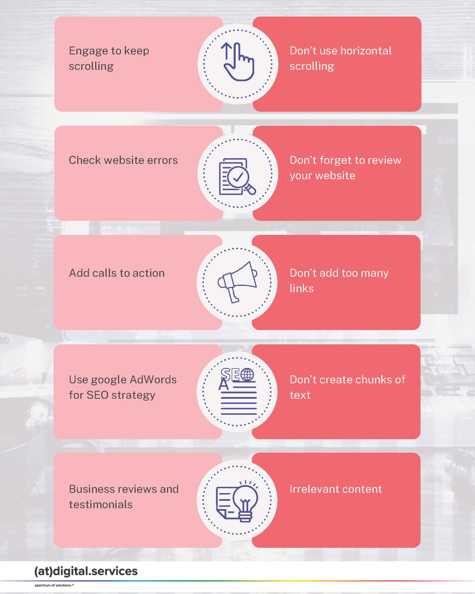
| Engage to keep scrolling: Make users engage highly with your content. They will spend more time on your site and continue scrolling to find out more about you and your service/products. | Don’t use horizontal scrolling: This is one of the reasons people can’t engage with content. Instead of making users scroll horizontally, design interesting content to continue scrolling down. |
| Check website errors: Scan your pages constantly to avoid any errors (404 errors) or typos to avoid losing users due to lack of maintenance. | Don’t forget to review your website: Check your website completely before launching for any errors, as well as the display on different devices. |
| Add calls to action: Invite your visitors to take action when visiting your website. As well as create ways to contact you easily. | Don’t add too many links: Think that the ideal path for customers should be at three links distance to find what they need. More than that could make your users lose interest, therefore leave the page. |
| Use google AdWords for SEO strategy: Build your strategy and drive qualified leads to your site using this Google tool. | Don’t create chunks of text: Big paragraphs of text will make it impossible to read, and users probably get bored and leave the page. Instead, design your page by breaking this into small paragraphs or small column-size text. |
| Business reviews and testimonials: It is well appreciated to know the experience of previous customers. | Irrelevant content: Don’t add irrelevant content to the webpage that consumes space and is not aligned with your offer. Think more, about what your users really need. |
Remember always that usability is the king of good web pages. Think about the reason users are on your webpage and share the content according to their necessities, and design an easy path to achieve their goal when visiting your website.


